Brochure Design: Corporate Training
Brochure Design: Corporate Training
Date
June 05, 2017
Category
Brochure, Brochure Design, Marketing Material Design, Print, Print DesignAbout This Project
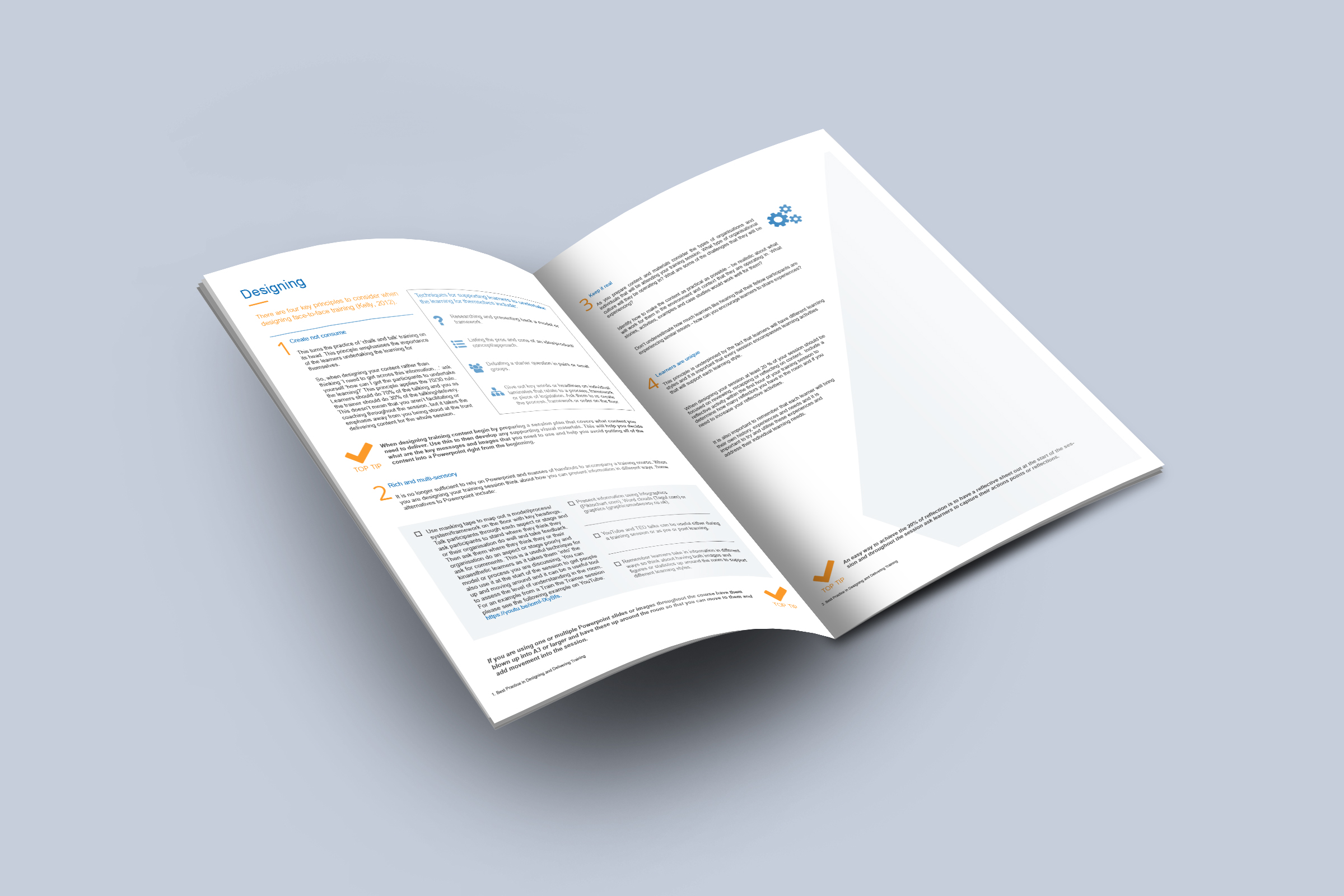
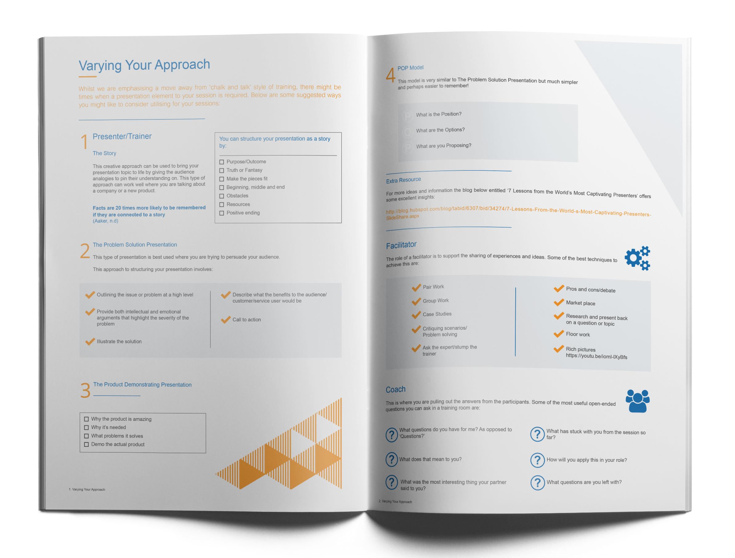
The corporate style guide for this customer was already well established before beginning this project. It was therefore essential to fully understand this brand and brand identity in order to create a document, which is seamlessly aligned with the company’s other printed literature and resources.
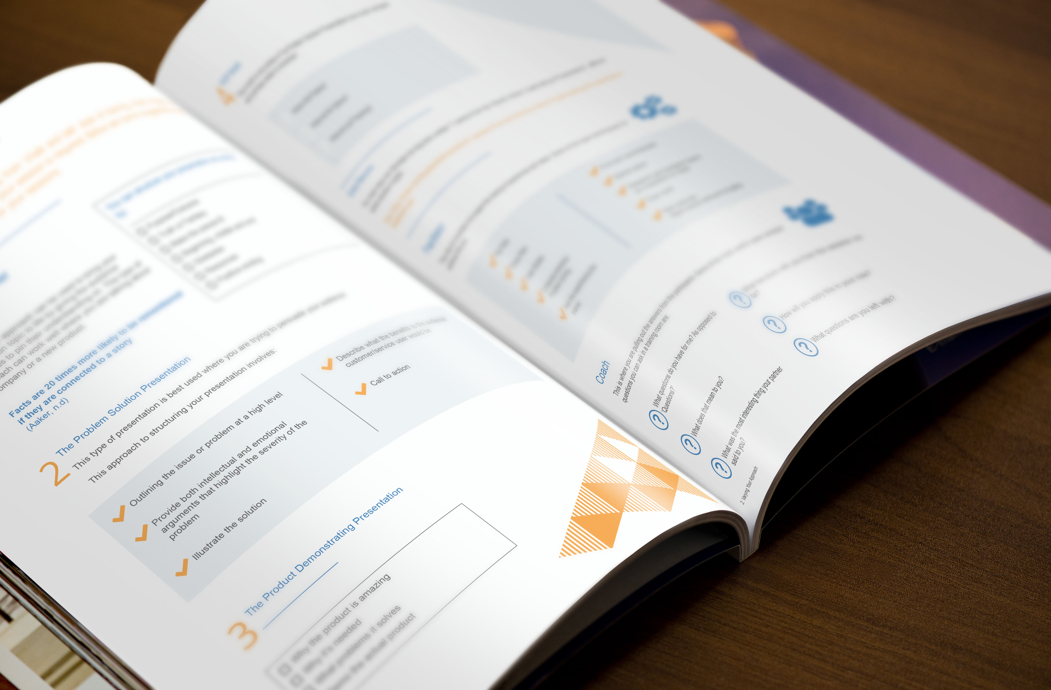
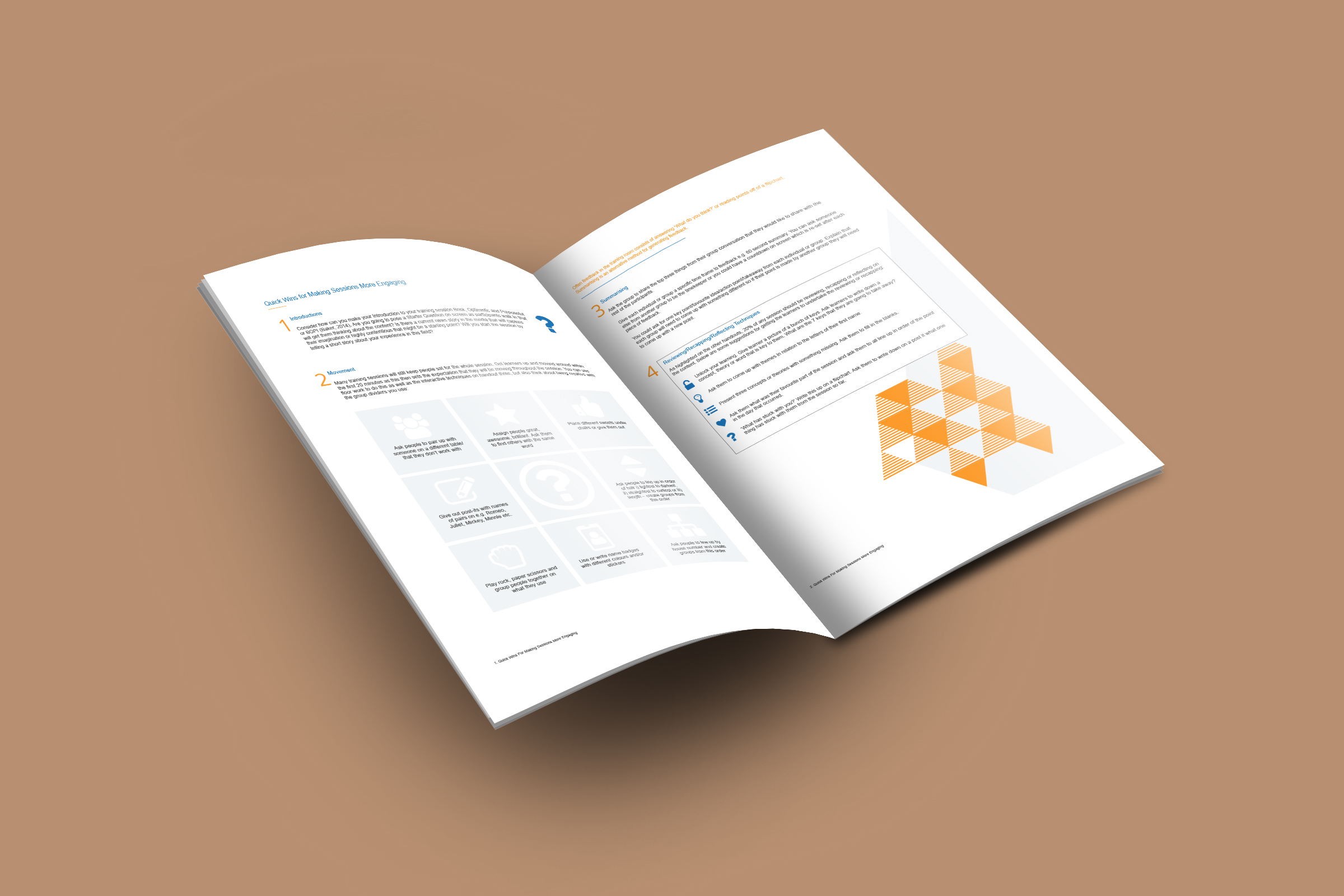
By applying their existing brand colours of blue orange and light grey, as well as continuing to utilise their chosen brand font, a consistent and clear message was portrayed.
It was important to break up the complex information that was to be displayed in the brochure. This was achieved by using simple graphic imagery, as well as a number of layout styles on each page. This ensured the resulting document was visually exciting and engaging to the user, as well as clearly and accurately portraying the information required.


